Your CTA’s will decide the actions of your visitors. Learn how to create unique CTA’s that will convert, and what to avoid.
We all know the struggle of creating strong call-to-action buttons that will showcase results. And if you find it hard as well, don’t worry, many copywriters are struggling with this part as well.
We have put together a couple of tips and examples on how to create good call-to-action buttons for your e-commerce pages and not only.
What CTA’s to avoid?

None of these CTA’s would bring you the desired conversions. And yes, this might be shocking as you probably saw many websites using them.
The truth is, the audience is now more aware and smarter than ever. And as personalisation is the future of digital marketing, you do need to learn to know your audience well and beyond and customise the CTA’s accordingly.
Create unique CTA’s
Don’t fear risking and try to be innovative with your CTA’s. You may be surprised to find out how well can convert unique CTA’s, tailored by the target audience.
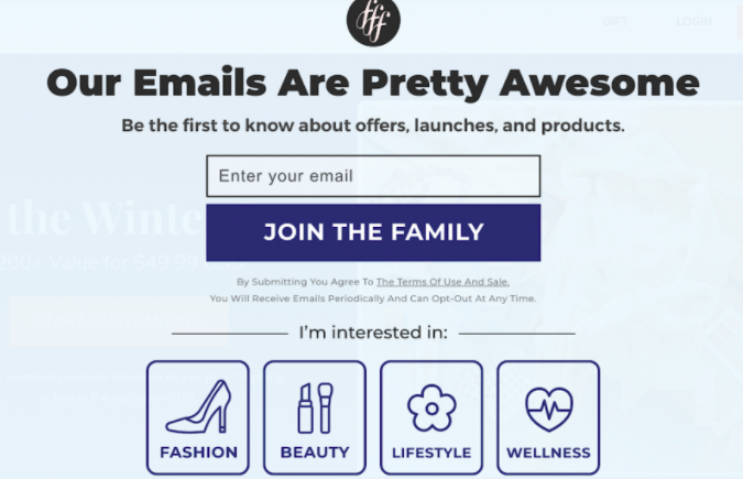
The example above shows how FabFitFun has found a unique way of asking visitors to subscribe to their newsletter. By using “JOIN THE FAMILY” and not the ordinary “SUBSCRIBE”, not only does this button takes advantage of our desire to belong but also avoids putting in the visitor’s mind the idea of being subscribed to ANOTHER newsletter.
Sell without selling!
Pay extra attention to your CTA’s, even when you are offering free things.
Let’s see some examples:
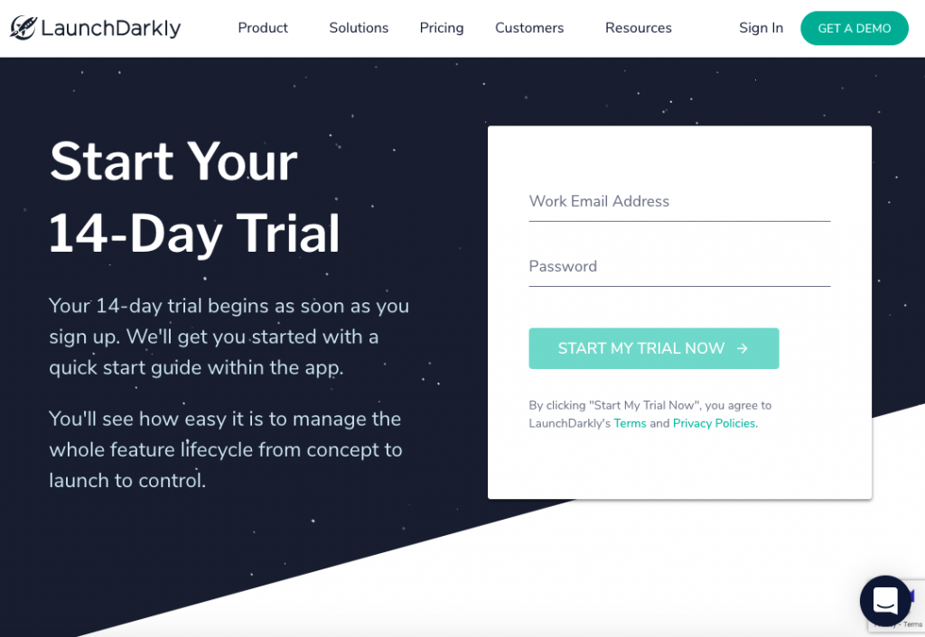
While LaunchDarkly’s landing page describes the ease of managing the whole feature lifecycle from concept to control”, the call to action is plain and does not show too much value for the visitors.
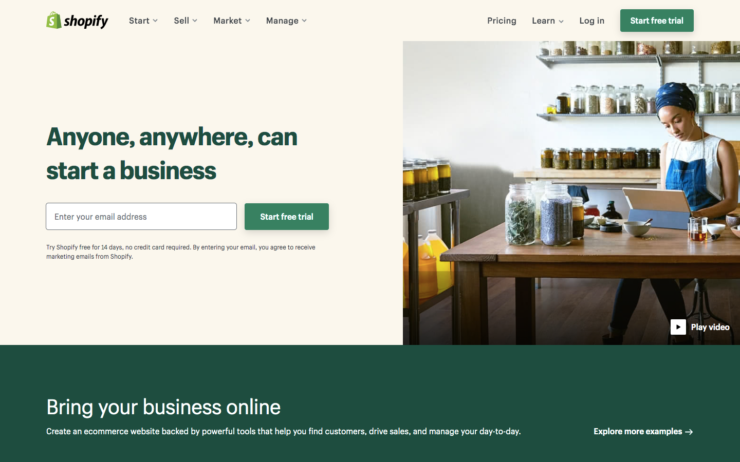
On the other hand, here is a good example of how Shopify has written the exact same CTA:
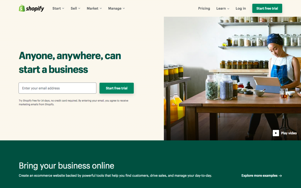
Because everything is sweeter when is FREE, you can see how Shopify has not only given a trial same as the other company, but also emphasised on the word FREE which is, perhaps, one of the strongest words used in copywriting.
Another quite important fact to bear in mind would be the consistency in colours. As in the first example, different shades of green are used, Shopify has kept the same dark-green colour throughout the whole main points of the landing page.
Therefore, learn how to sell your trial, and don’t ignore this step, as free trials have been proved to increase revenue by over 25%.
Call up curiosity with your CTA’s
Curiosity makes you want to jump on an offer because you can envision the reward and how it can improve your own life. Therefore, if you are selling, for example, an e-book, consider avoiding the ordinary “DOWNLOAD NOW”.
Instead what you could do, is make your visitors curious about how can that book improve their life.
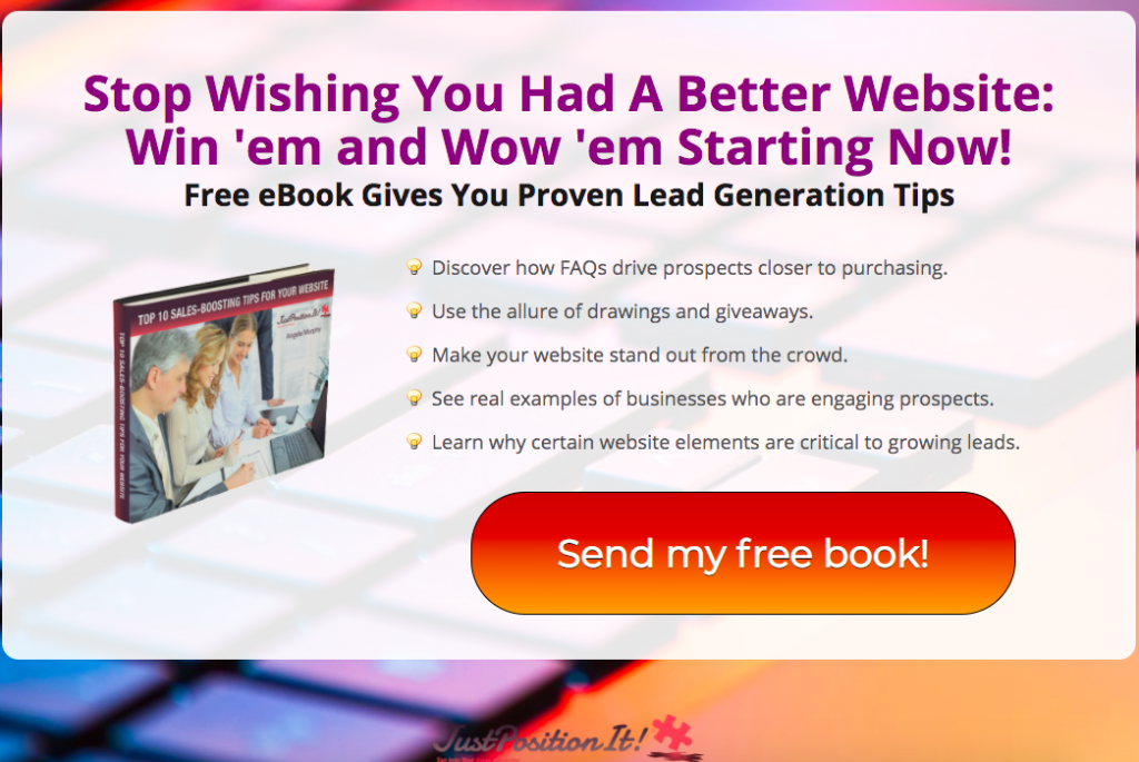
This is a very good example from JustPositionIt. This landing page has:
✓ A strong, motivational headline. (Win’em and Wow’em Starting Now)
✓ Describes the benefits of getting their e-book WITHOUT revealing too many details. (Increases curiosity)
✓ A perfect CTA – “Send my free book”- Sells without selling, makes the customer aware of getting something for free, so that not necessarily consciously, the book would be downloaded.
In the end, copywriting is an art and it is true that it can take years to learn. But paying attention to this kind of details and constant research, can make a significant increase in your conversions.
Be the first to leave a comment